Project Background:
Mirror was founded back in 1994 and has become a highly successful
clothing brand. Their aim has always been to deliver quality clothing
at affordable prices.
They currently have more than 400 stores worldwide and are looking
to improve their brand / increase online sales through a logo and website
redesign.
clothing brand. Their aim has always been to deliver quality clothing
at affordable prices.
They currently have more than 400 stores worldwide and are looking
to improve their brand / increase online sales through a logo and website
redesign.
Timeline: 4 weeks
Project Objectives:
1. Refresh Mirror’s Logo
2. Create a new responsive website design
2. Create a new responsive website design
Research
Competitive Analysis, Provisional Personas, Secondary Research, User Interviews
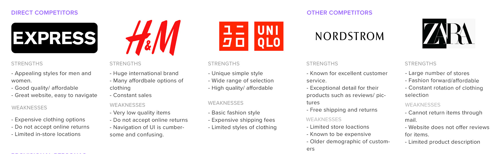
Competitive Analysis:
For this analysis, I studied a wide range of other top online retail competitors. I made a list of all their strengths and weaknesses.
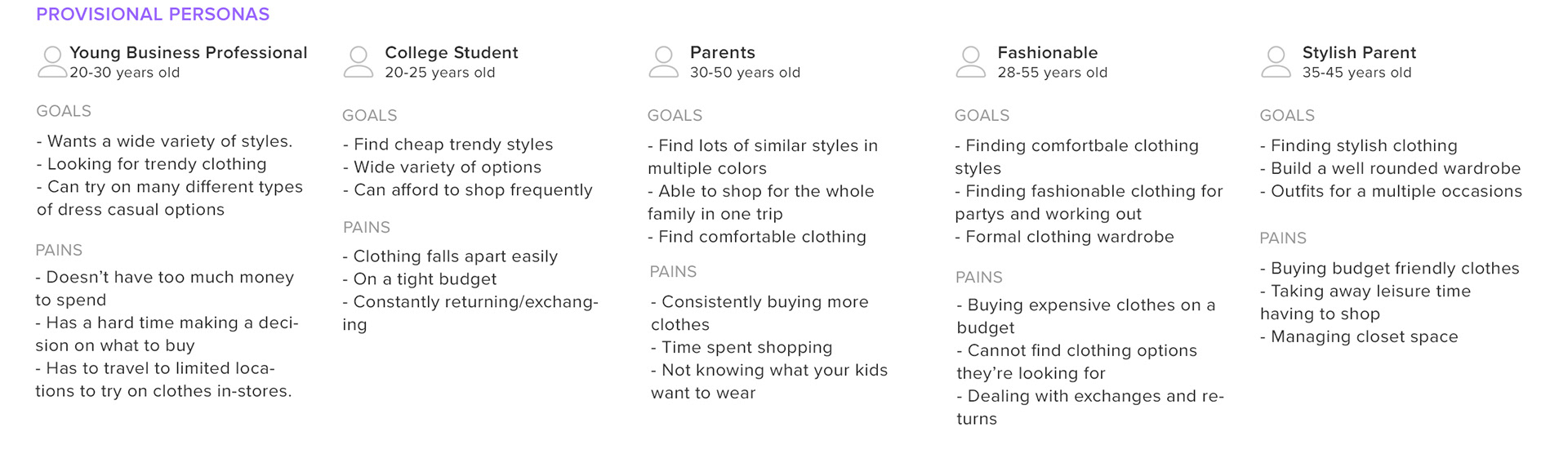
Provisional Personas:
With each of the companies I researched in my competitive analysis, I assigned a provisional persona to help me define the target market of each company.
Secondary Research:
I conducted secondary research to further understand the market and current trends when it comes to online vs. in store shopping. In addition, I looked at the cons of online shopping for both customers and the companies themselves.
Findings:
Retail trends of 2020:
- While consumer spending has been reduced due to the pandemic, online purchase percentage has increased greatly.
- A shift to increased e-commerce has forced companies to either adapt or lose a piece of the market share to competitors.
- Implementation of new technologies such as augmented reality fitting rooms allow customers to try on clothes virtually.
Online shopping cons:
Customers
- Knowing what you are buying based on pictures.
- Clothing fit isn't always accurate.
- Relying on customer reviews.
Companies
- Deciding whether to satisfy the customer with return policies or save money for the company.
- Adjusting to online shopping infrastructure and training employees accordingly.
User Interviews:
Interviews consisted of 5 participants who are all experienced online shoppers.
Goals:
- To gain a better understanding of how people prefer to shop and why.
- Understand if online or in-store shopping is the preferred method.
- Create a list of features people enjoy using when shopping online.
- Better understand the current pain-points of the online shopping experience.
- Understand if online or in-store shopping is the preferred method.
- Create a list of features people enjoy using when shopping online.
- Better understand the current pain-points of the online shopping experience.
Findings:
- The preferred shopping medium is online because of convenience and it saves time.
- Most people shop on their personal laptops or desktops.
- Key features: Solid filter system, body-type specific fitting, easy checkout, detailed product description, simple navigation.
-Most common habits for saving items for future purchase: Keeping tabs open in browser.
- Most people shop on their personal laptops or desktops.
- Key features: Solid filter system, body-type specific fitting, easy checkout, detailed product description, simple navigation.
-Most common habits for saving items for future purchase: Keeping tabs open in browser.
Define
Personas, Empathy Map, Project Goals
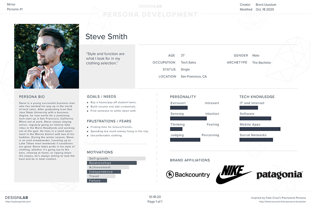
Personas:
Two personas were made to best describe the target users of my e-commerce website.

Empathy Map:
I used this empathy mapping exercise to engage with the emotions of my user to better understand them.

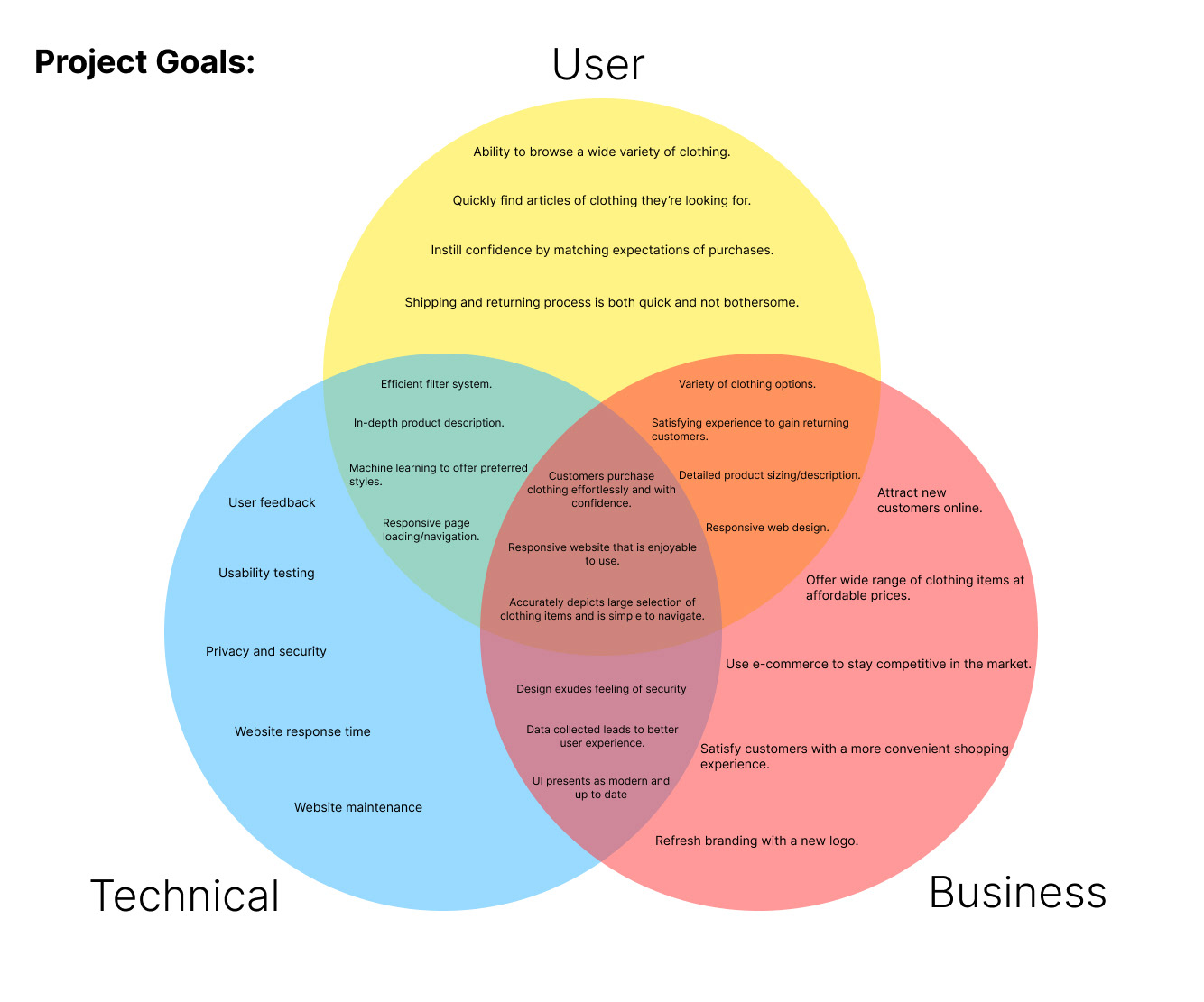
Project Goals:
Defining the project goals from a user, business and technical perspective helped narrow the focus on what the important aspects of this website design should be. It also highlights where the interests of each sector intersect, illustrating the most prominent design decisions.
Ideate
Card Sort, Sitemap, Task / User Flow, UI Requirements
Card Sort:
I used a card sorting exercise with two participants to gain understanding of how online shoppers would categorize their clothing items. The aim was to help me structure my information architecture of the website.
Findings:
- Opportunity for a robust tagging system integrated into the website.
- Users use many different words to search for the article of clothing they're looking for.
- Subcategories is a useful way of breaking down larger groups of clothing into refined subgroups.
- Filtering the users search results is most effectively coincides with the stakeholders desires.
- Users use many different words to search for the article of clothing they're looking for.
- Subcategories is a useful way of breaking down larger groups of clothing into refined subgroups.
- Filtering the users search results is most effectively coincides with the stakeholders desires.
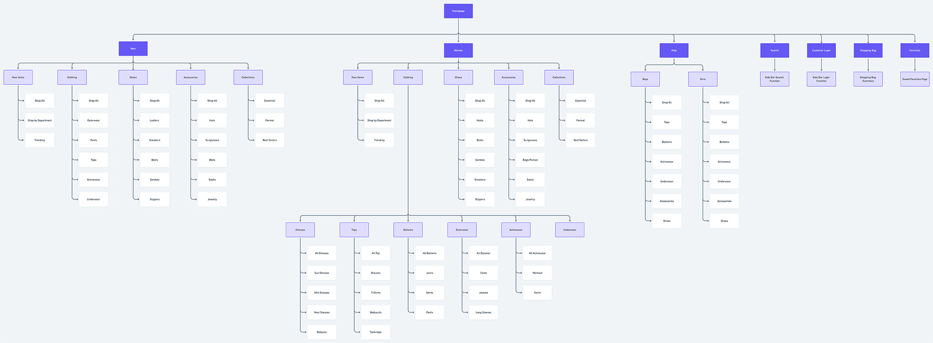
Sitemap:
Card sorting helped me to organize the categorization of my e-commerce websites information architecture, this is the site map that I built from those findings.
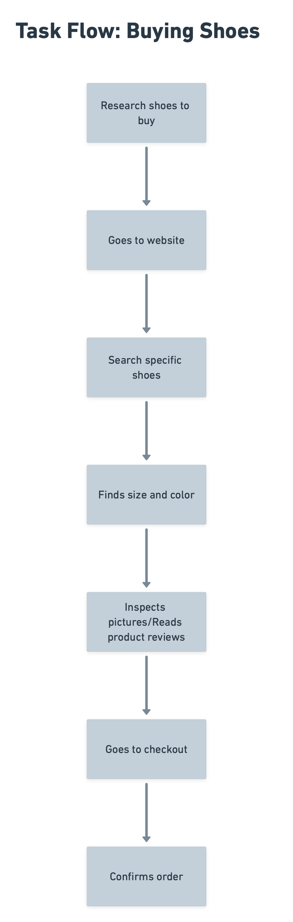
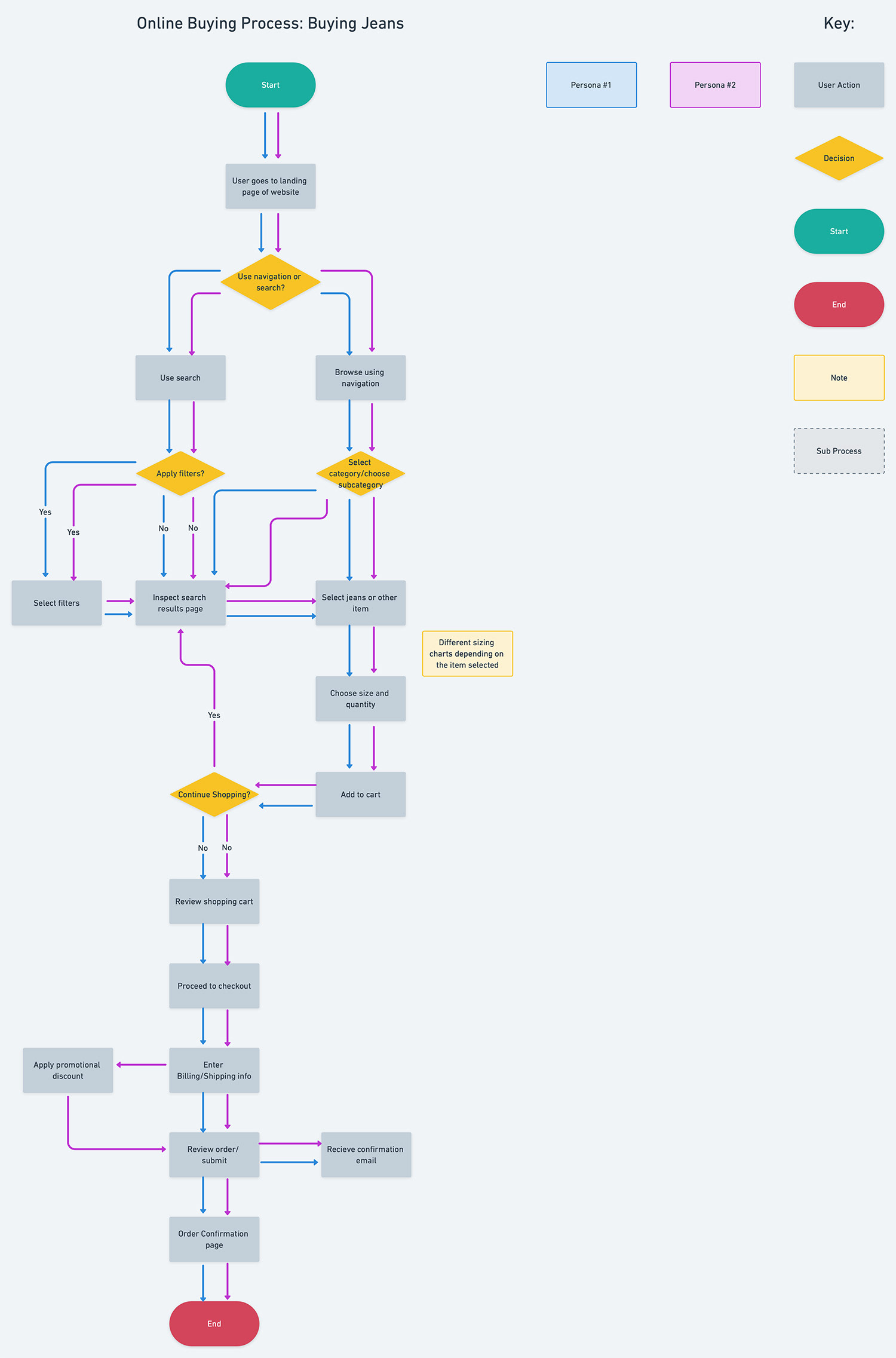
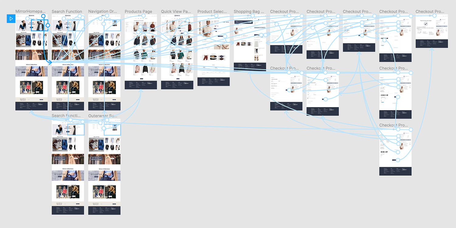
Task / User Flow:
I outlined a quick task flow showing the steps the user would go through to buy an item. Next I created a user flow of the online buying process, this was from the perspective of both of my created personas.
UI Requirements:
At this stage of the design, I listed out all the required UI feature from most important to least important to help the user efficiently make it through the online buying process.
Design
Sketches, Mid-Fidelity Wireframes, Branding
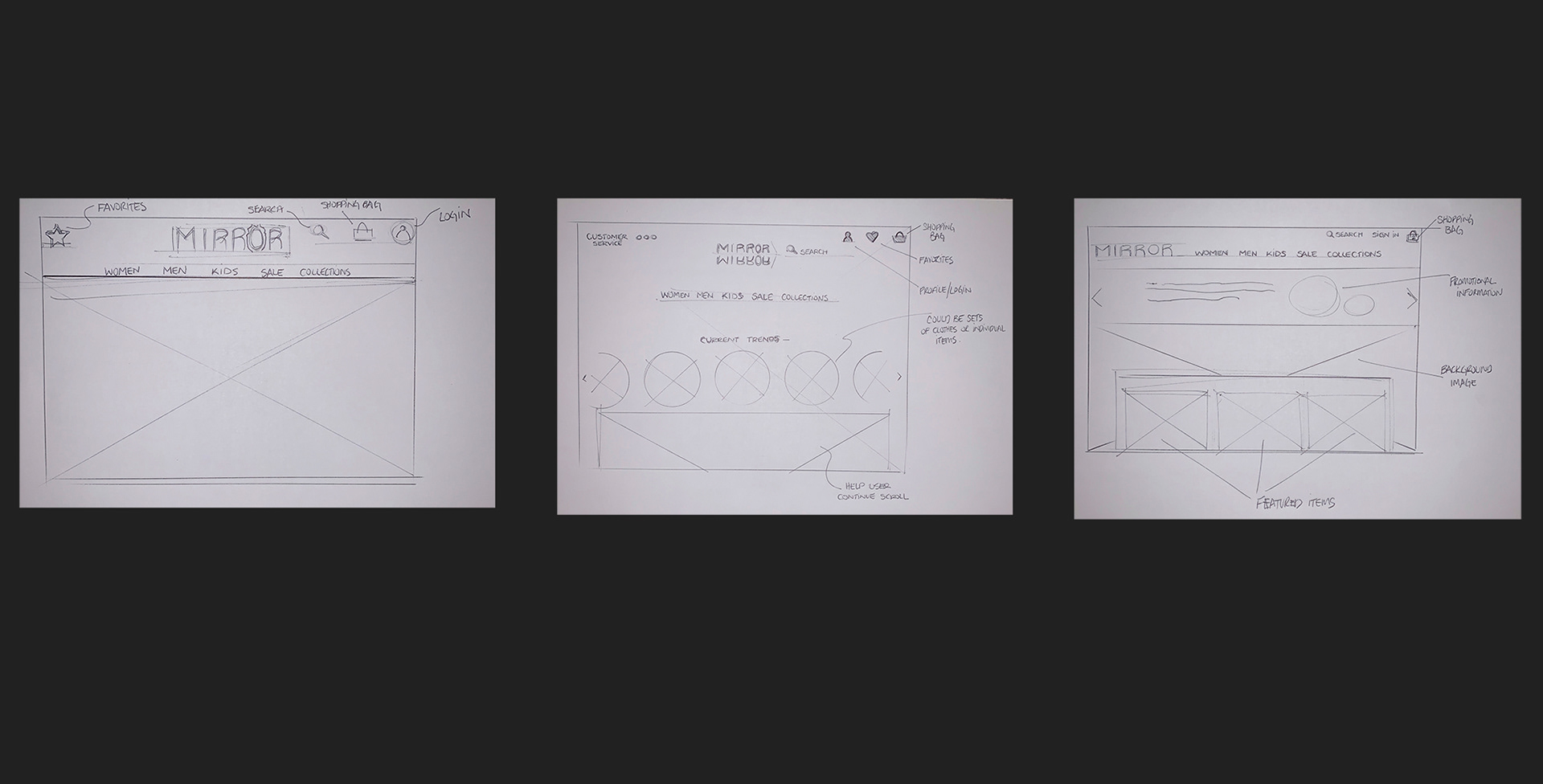
Sketches:
Rapid sketching helped me get a quick idea of how I wanted the website layout to look.
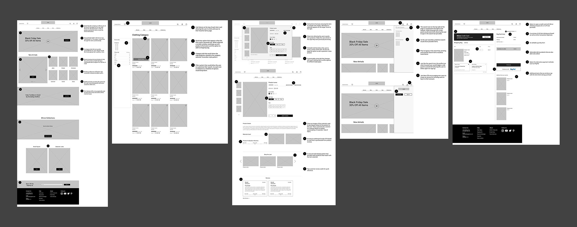
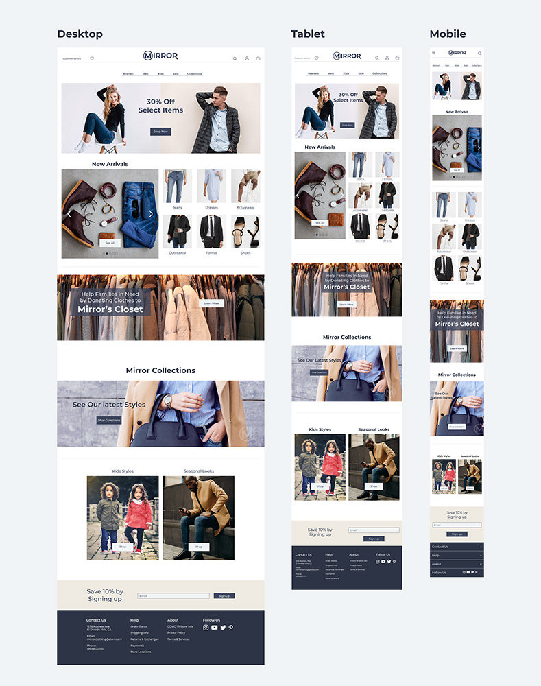
Mid-Fidelity Wireframes:
I created these mid-fidelity wireframes to outline how my UI would look and function, I annotated each section to describe the function of each design pattern.
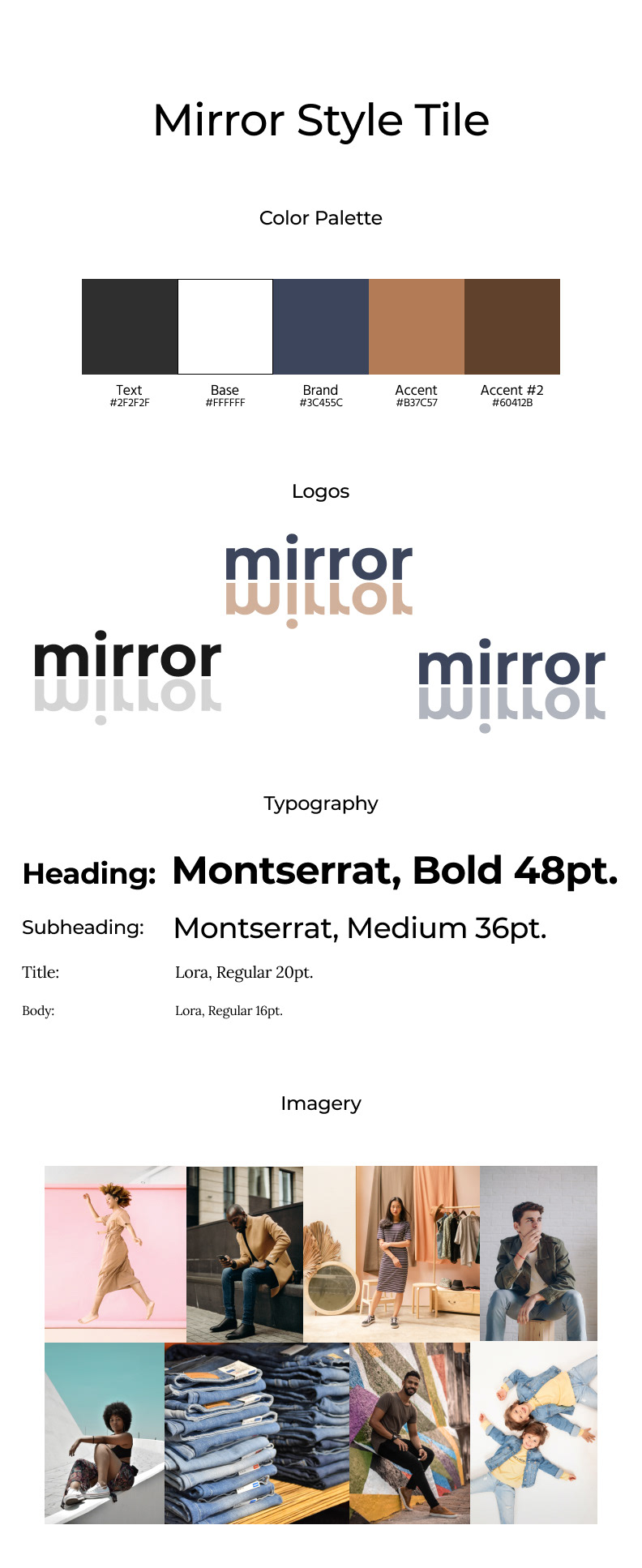
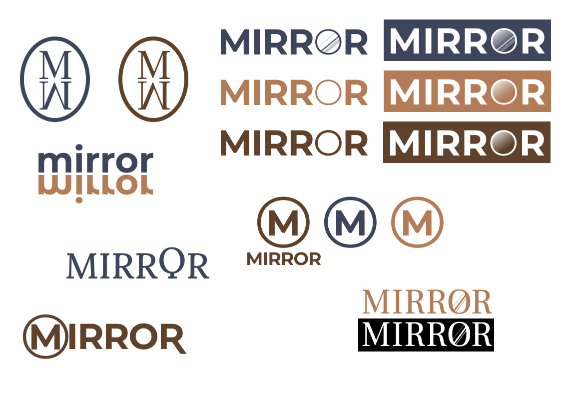
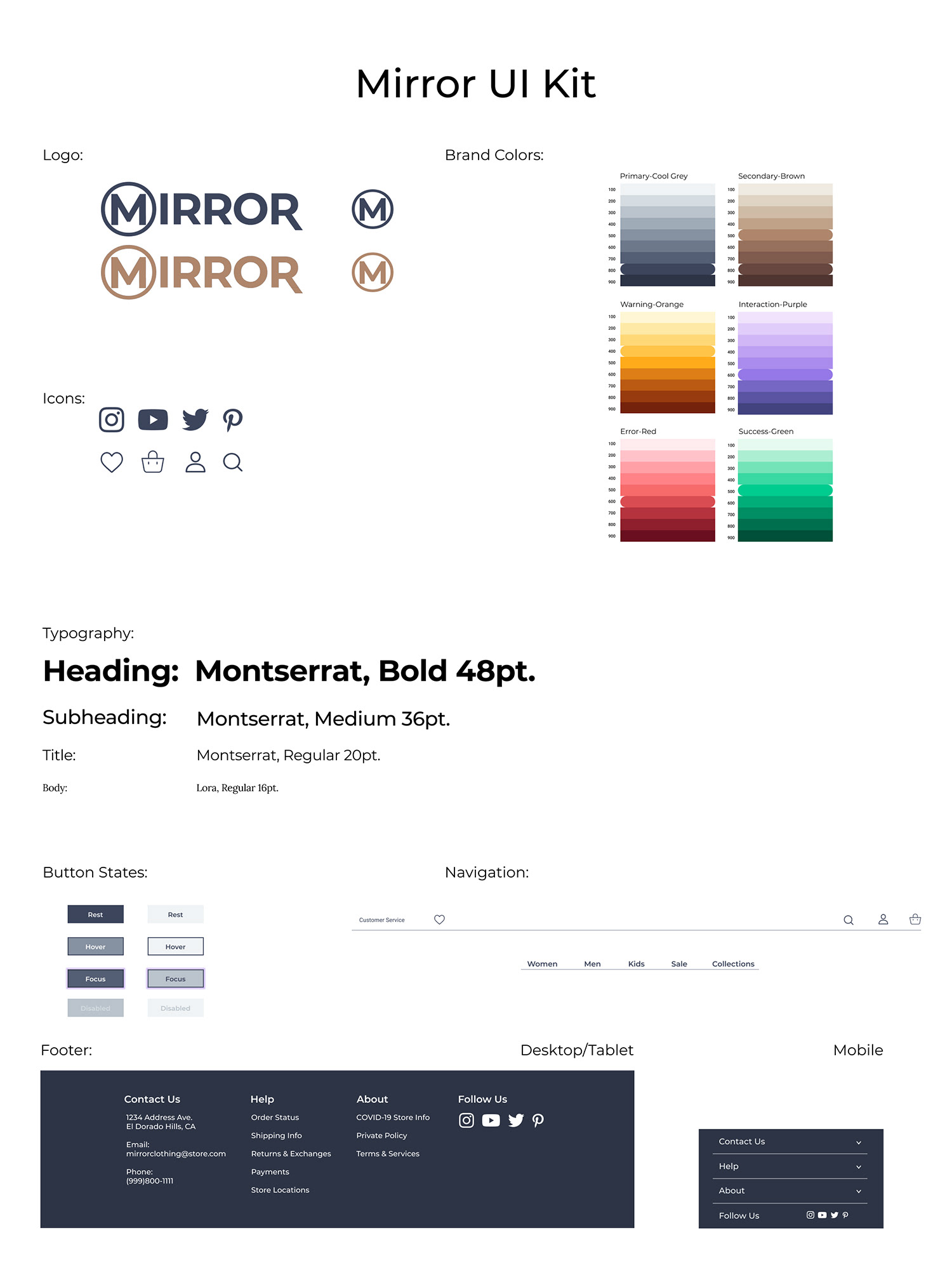
Branding:
I created a style tile for the company brand along with some logo ideation.
Prototype
High-Fidelity Wireframes, High-Fidelity Prototype
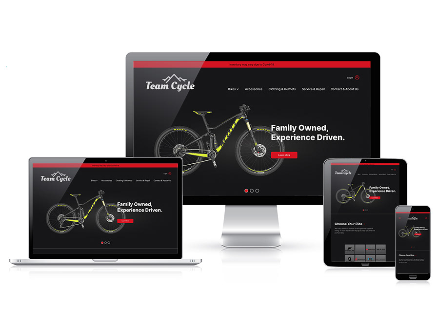
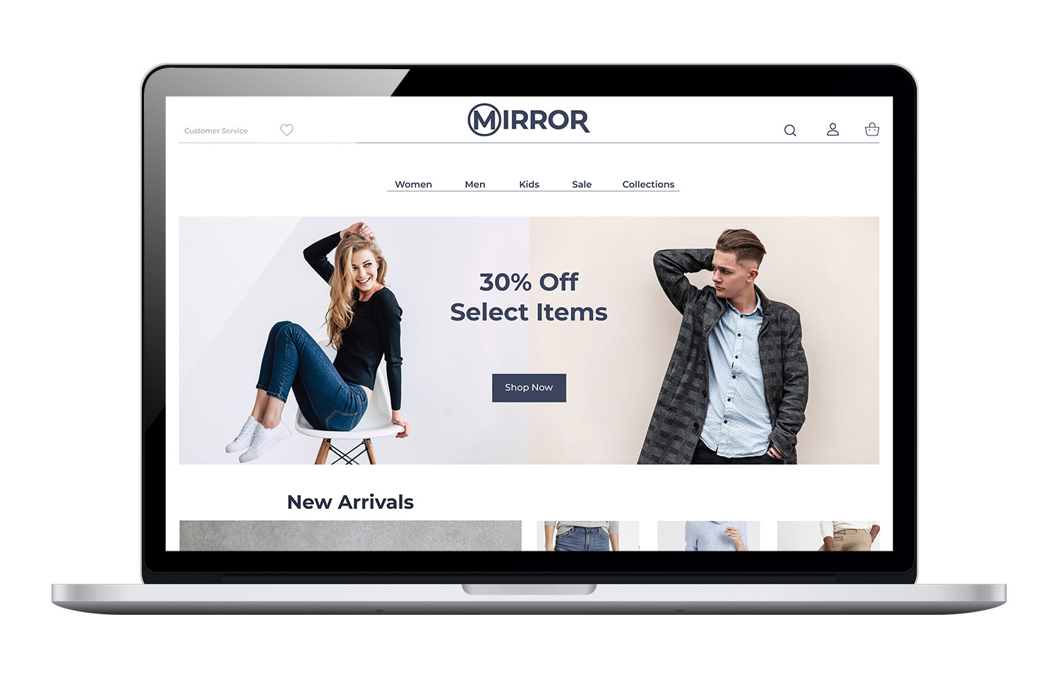
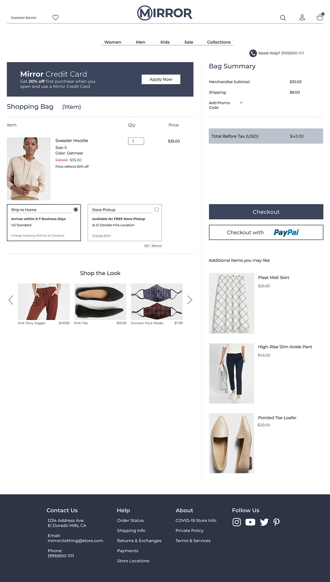
High-Fidelity Wireframes:
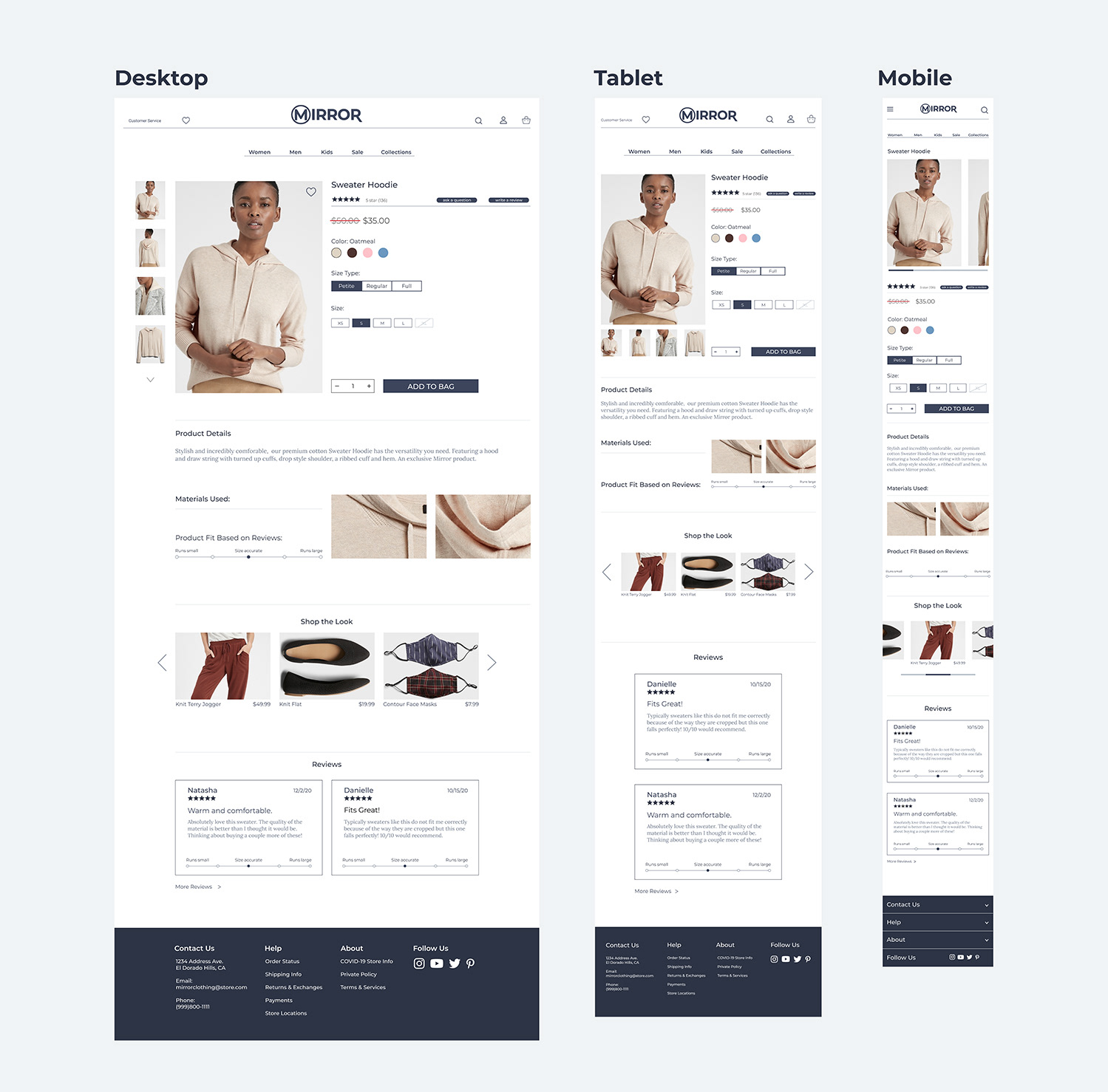
High-Fidelity Prototype:
Test & Refine
User Testing, Affinity Map, UI Kit, Final Design
User Testing:
Scope:
- For my user testing I had 5 individuals, who are experienced in online shopping, go through a set of tasks using my high-fidelity prototype. The goal was to identify snags in the user flow and to document any part of the UI that was confusing or unpleasant.
Tasks:
1. Find both forms of navigation from the home page, categorical and search function.
2. Input desired clothing item “sweatshirt” into search function and continue to product page.
3. Select item using either the quick view function or clicking directly on the product name.
4. Add the item to the shopping bag and continue to the shopping bag page.
5. Proceed to checkout/ fill in forms for contact information, shipping details and credit card info.
6. Place order and recieve confirmation.
Objectives:
- Test and understand the ease of use of my Mirror website.
- Observe points of confusion when going through the checkout process.
- Test how easily users can purchase items they are looking for.
- Find areas to improve the navigation of the site.
- Determine whether the prototype can effectively get the user to select the predetermined article of clothing, put it in the shopping bag and successfully make it to the confirmation page of the checkout process.
Key Findings:
Insights
- All three participants found navigating to the product page confusing.
- Main navigation bar needs more detail to items shown.
- Imagery was loved by all participants.
- Search function confused 1 of the participants, they didn’t understand what to click.
- Main navigation bar needs more detail to items shown.
- Imagery was loved by all participants.
- Search function confused 1 of the participants, they didn’t understand what to click.
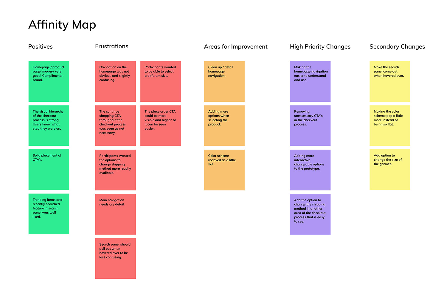
Affinity Map:
This affinity map was created using the data from my usability testing. It highlights the good and the bad and suggest the most important changes that need to be made.
UI Kit:
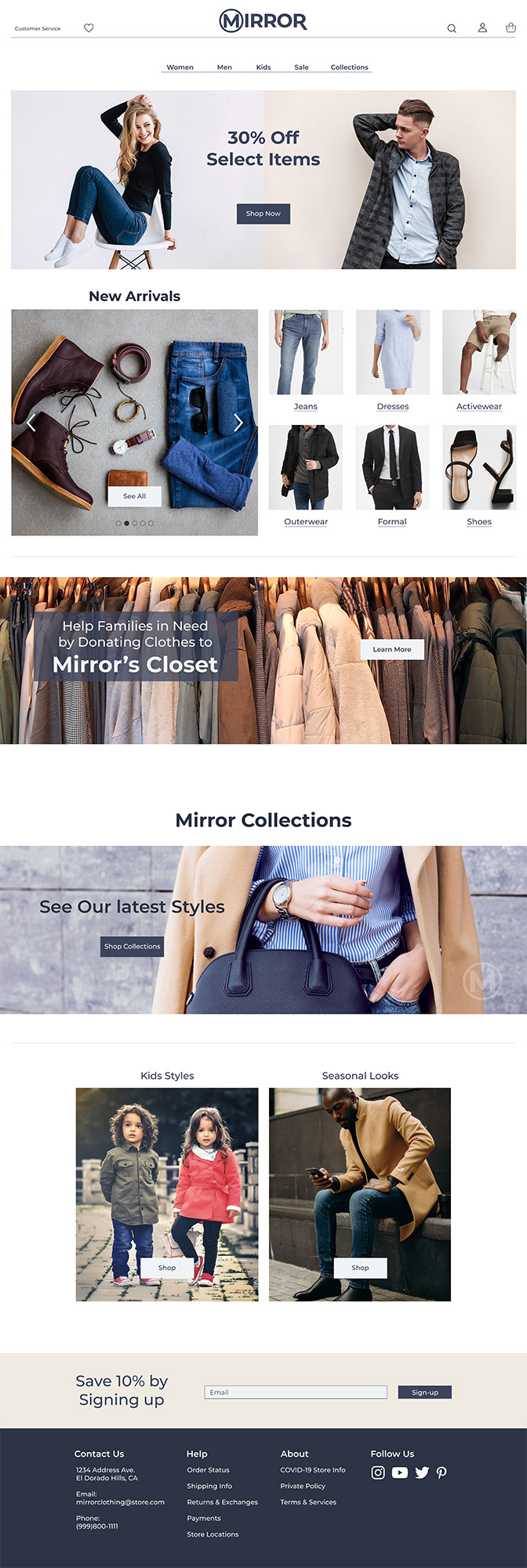
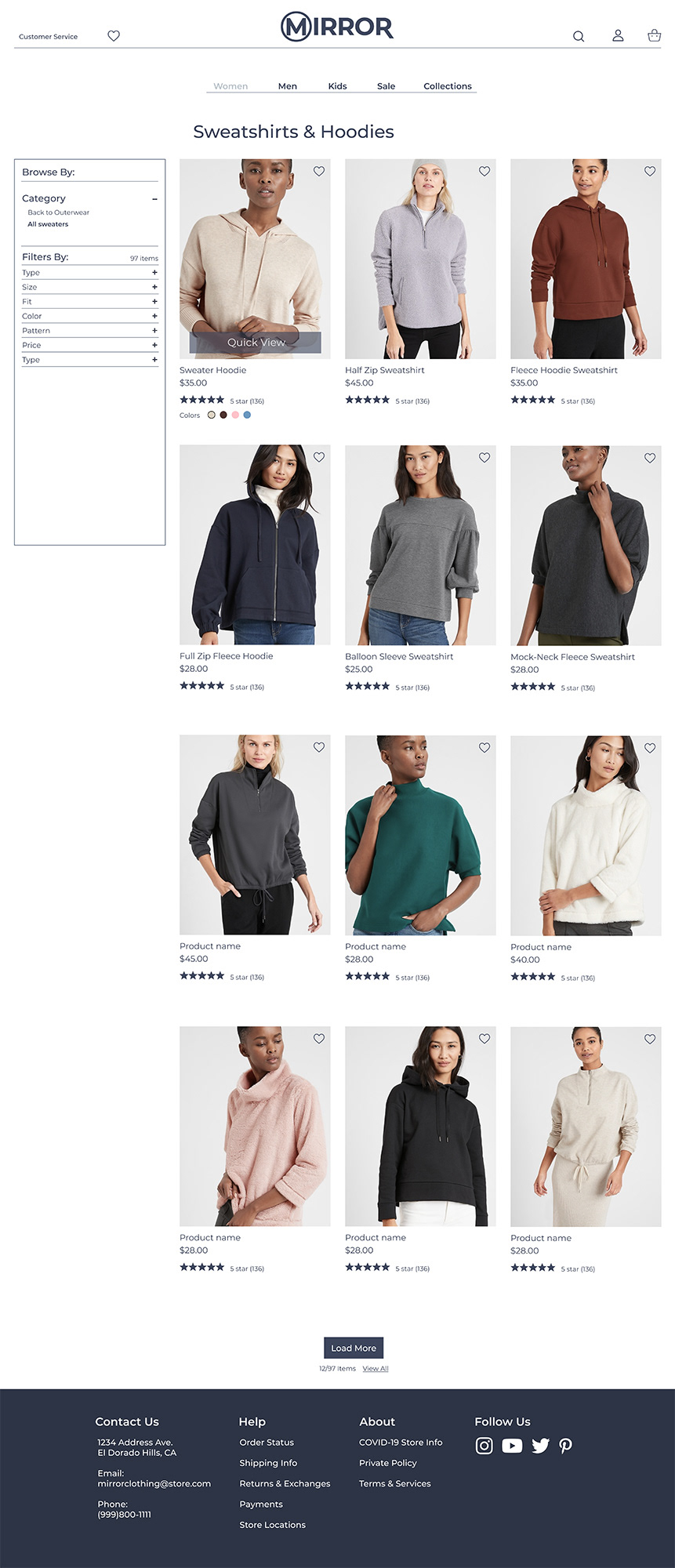
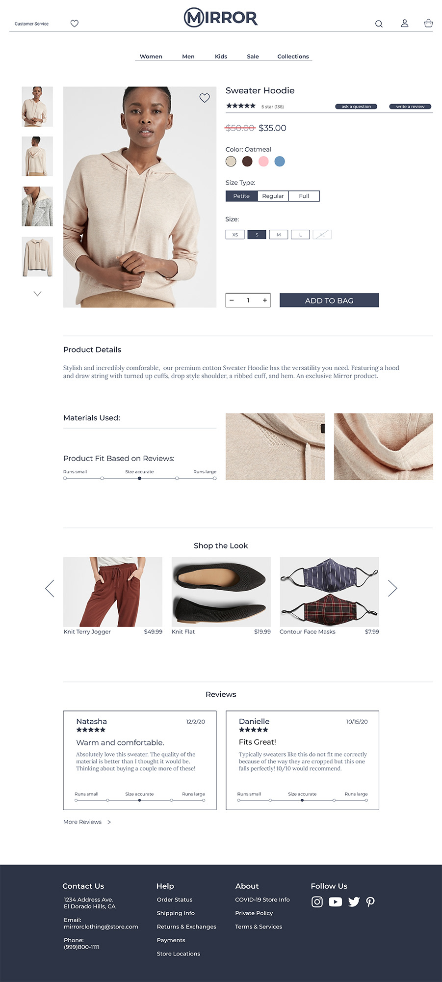
Final Design:
Reflection
For my first website design I have done, I learned an enormous amount from this project. It gave me a great idea of how the design process works and what you can uncover by going through every step. I am proud of the work I was able to complete in such a short amount of time. Working on a speculate project as though it is a real client absolutely helped me understand what it would be like to work as a UX designer in the real world. This was a great project to get my feet wet.
Next Steps
- Make the navigation on the homepage easier to use.
- Refine elements such as unessessary CTA’s.
- Make more features of the design interactive.
- Use more of my color palette to make the design pop better.
- Refine elements such as unessessary CTA’s.
- Make more features of the design interactive.
- Use more of my color palette to make the design pop better.