Project Background:
Team Cycle is a well known and successful bike shop in the El Dorado Hills, CA area. Due to the pandemic, the biking industry has taken off and Team Cycle wants to compete with the competition in the area. They are looking to refresh their website to appear more professional while also adding a responsive redesign.
Timeline: 4 weeks
Project Objective:
- Better understand the biking market in the area and tailor their website to boost the company's bottom line.
- Build a responsive website design.
- Refresh the company logo.

Research
Market Research, Competitive Analysis, Heuristic Evaluation, User Interviews, Empathy Map
Market Research:
I started off this project by conducting market research to gain perspective on the current bike market. This led me to understand the pros and cons of small and large bike shops as well as the demographics of individuals who shop at them. Researching the current biking industry highlighted how in demand bikes and bike parts are right now due to the pandemic. That high demand for biking related products online shows the benefit of shopping in store.
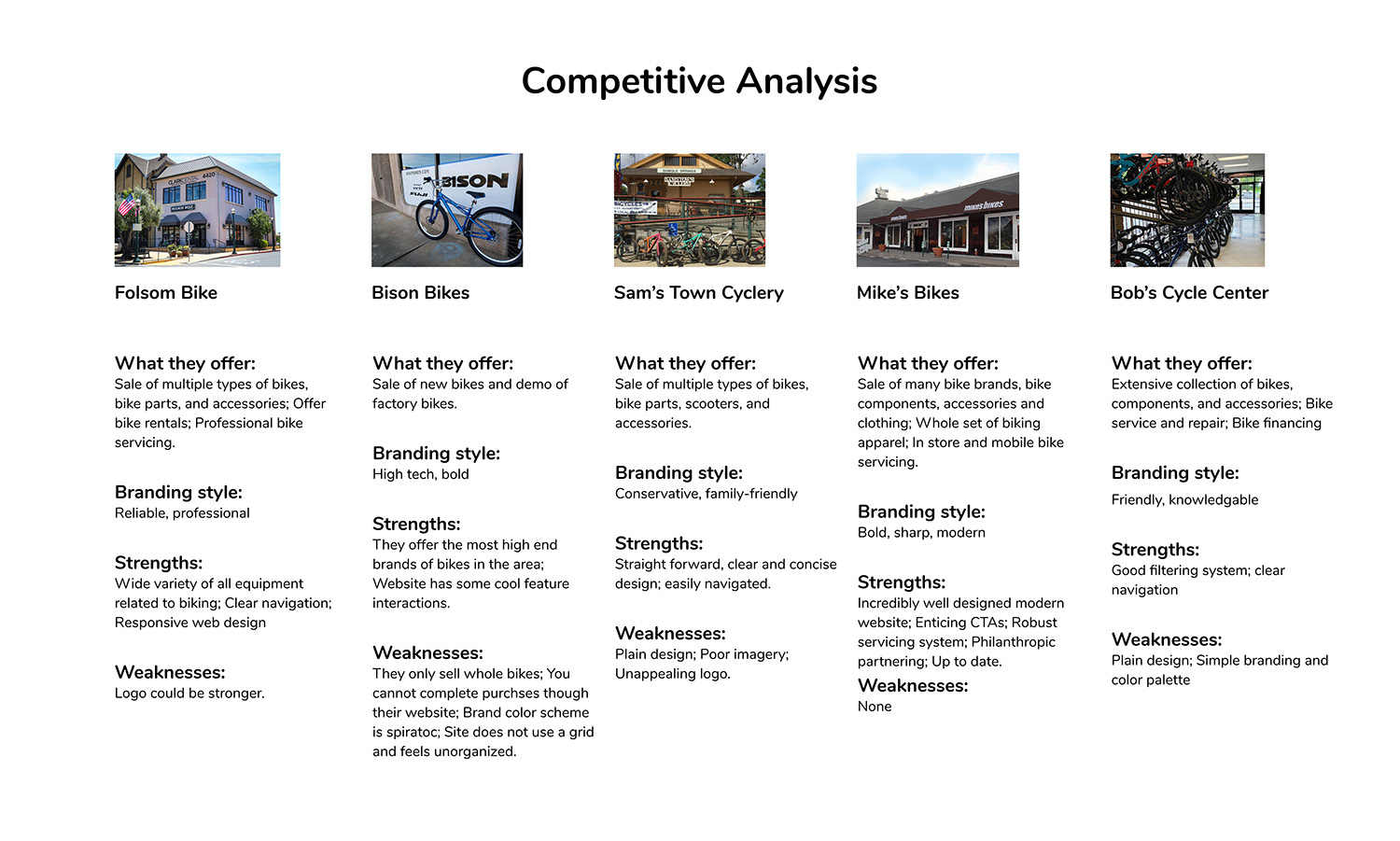
Competitive Analysis:
Making a list of the competitive bike shops in the area and viewing what features their websites offer helped me gain a sense for where Team Cycles website should be positioned in the market.
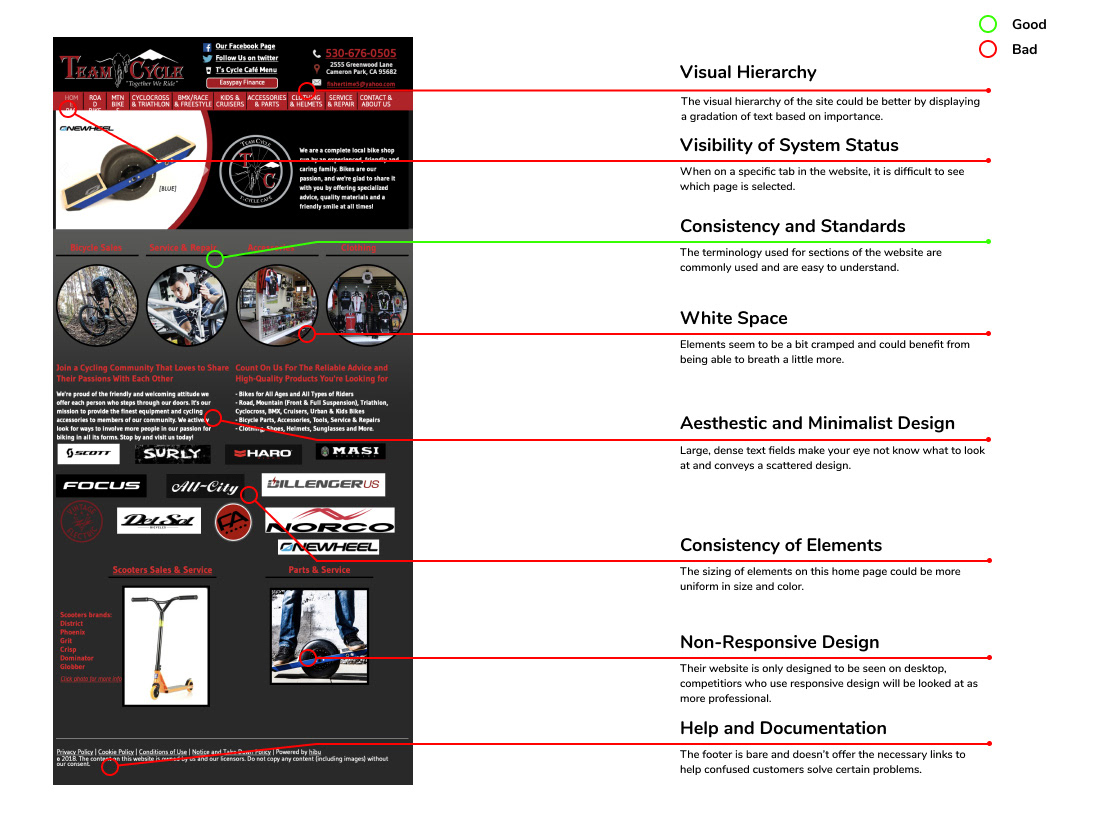
Heuristic Evaluation:
I took some time at the start of this project to break down Team Cycles existing website homepage and highlight the pros and cons. This also gave me time to take in their current design and brainstorm the ways I could build on it.
User Interviews:
My goal for these user interviews were to gain a better understanding of how people shop for bikes and biking related equipment, determine what customers need out of a small bike shops website, and define what features could help benefit Team Cycle’s bottom line.
Findings:
1. Preferred style of bike shop: Mom and pop vs. Big retailer (both have benefits).
2. Method for shopping for a bike or bike components: Most use a combination of sites and sources before making a purchase.
3. Brand names carry weight and are trusted, biking apparel was a mix of needing to try on vs. just purchasing online.
4. Consensus on bike servicing: Rarely needed but when it is, convenience is key.
5. Calling in to book is fast and easy but pople would take advantage of an online booking system if it was simple to use and easy to specify what needs to be fixed.
6. Features people look for in a good bike shop website: Rewards program, FAQ, clear understanding of whats in stock, great imagery.
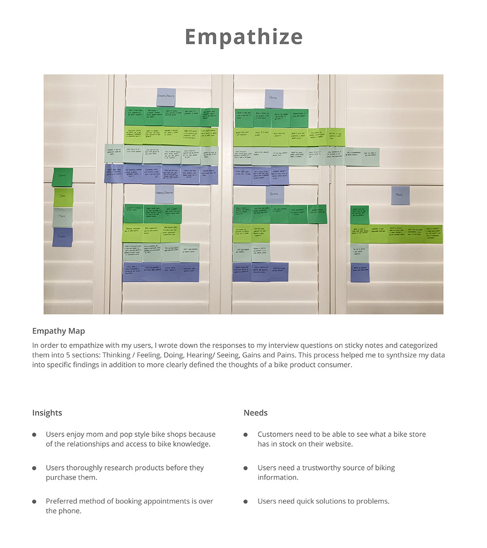
Empathy Map:
The creation of this empathy map was to more clearly define the insights I gained from my user interviews and help synthesize user needs from those insights.
Define
Personas, HMW Questions, User Journey Map
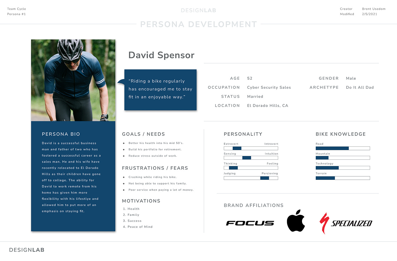
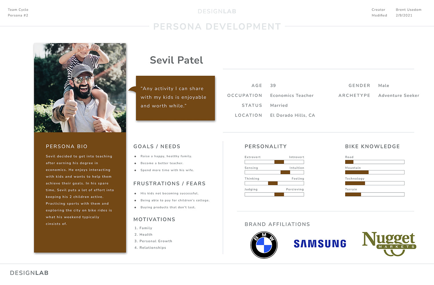
Personas:
When developing these personas, I tried to take all the insight I gained from my research and combine those findings with a general demographic of the type of people who live in the area and would be accessing local bike shops.
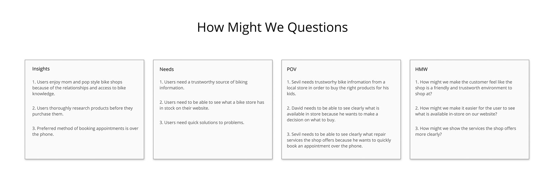
HMW Questions:
These "how might we" questions were developed through my empathy map exercise. From the insights and needs that I discovered, I was then able to formulate POV statements from the perspective of the two personas I developed. These statements were then restructured to ask questions that could solve important problems for the user.
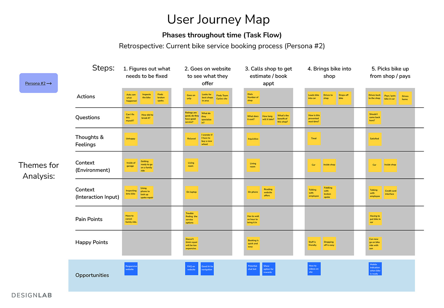
User Journey Maps:
This user journey mapping exercise was used to view the personas journey through the use of the bike shop website and visiting the shop in person. Its purpose was to uncover wrinkles in the users experience and offer solutions to those unpleasant steps. I discovered that most customers who rely on mom and pop biker shops would be coming into the shop to buy items or ask questions as opposed to buying products from their website online.

Ideate
Feature Roadmap, Sitemap
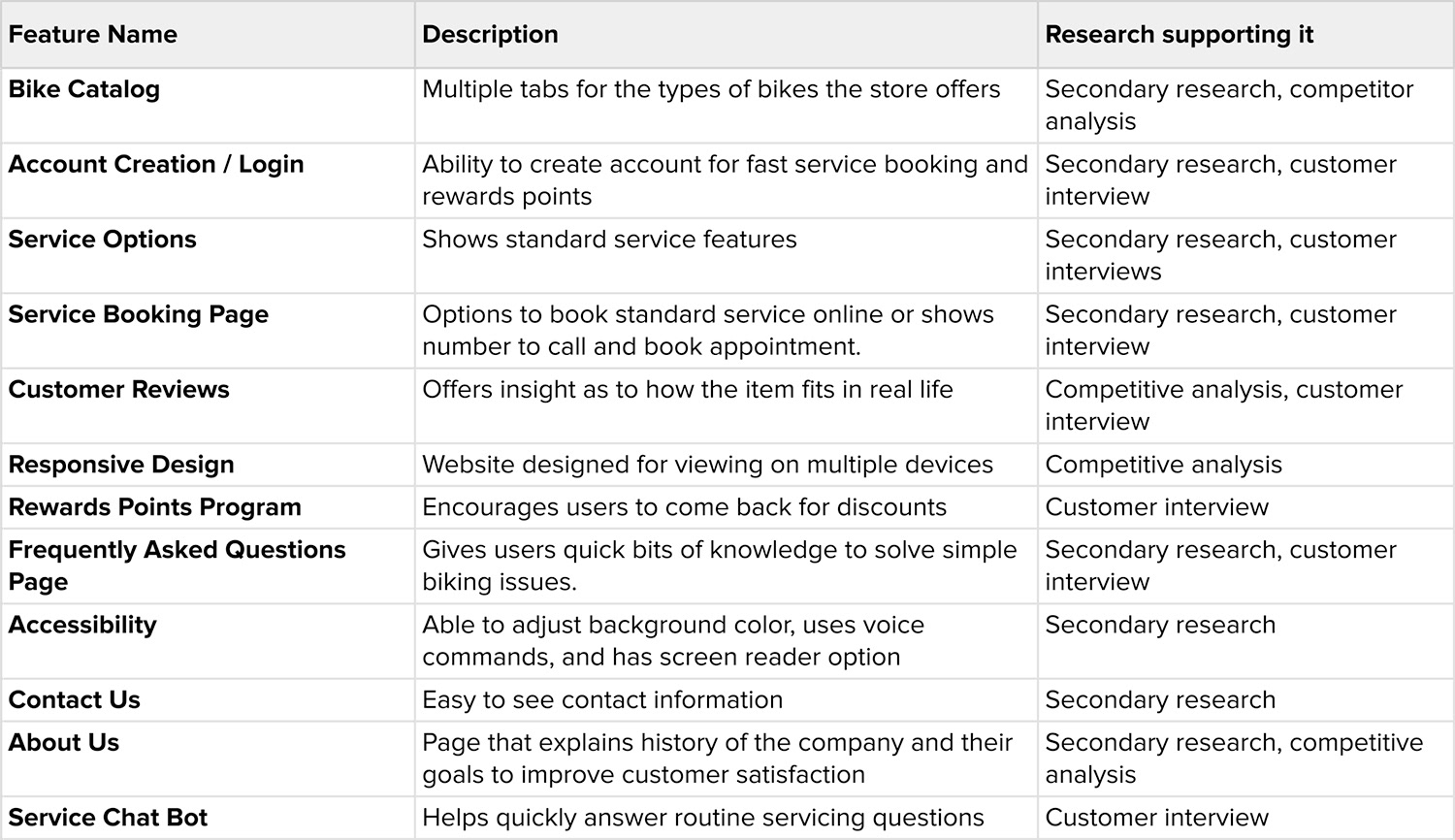
Feature Roadmap:
I came up with a list of potential features that were necessary for the design of this website. Existing feature were maintained with some new features added.
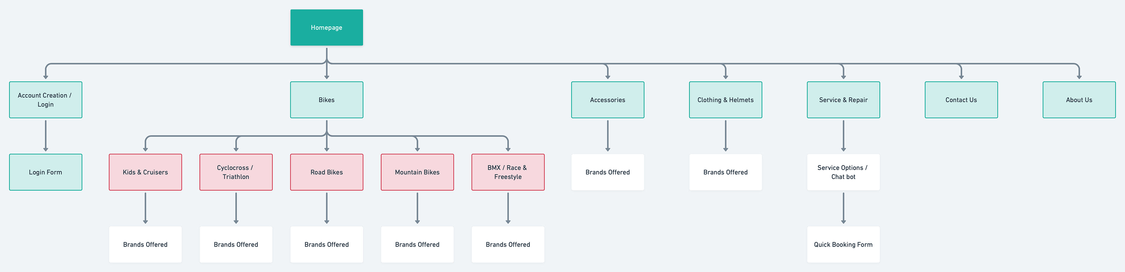
Sitemap:
This sitemap outlines the basic structure of the website design.
Design
Wireframe Sketching, Low-Fidelity Wireframes, UI Kit, High-Fidelity Design, Responsive Screens
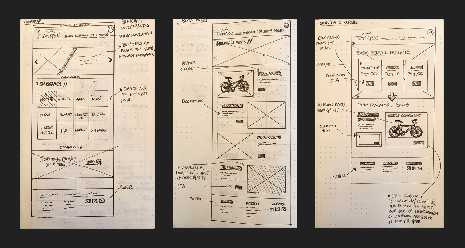
Wireframe Sketching:
Quickly sketched out wireframes helped me to visualize the basics of how I wanted the new design to look.
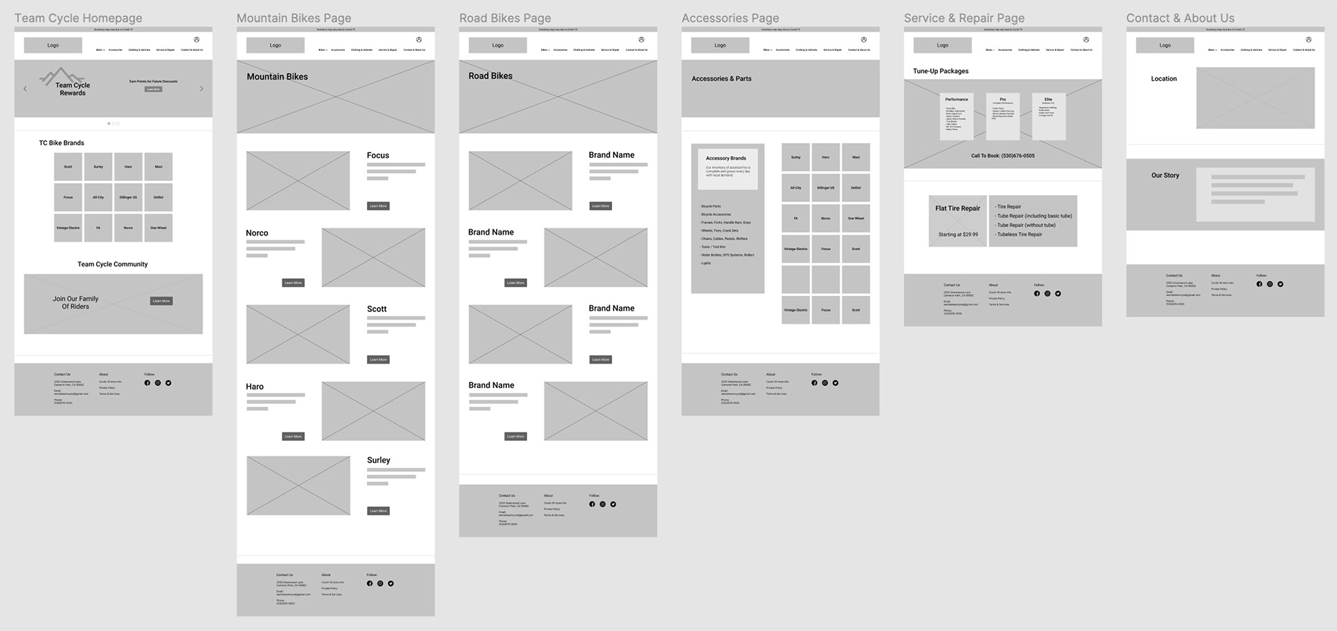
Low-Fidelity Wireframes:
After inspiration came from sketching out various website pages, I then started designing the website in low-fidelity.
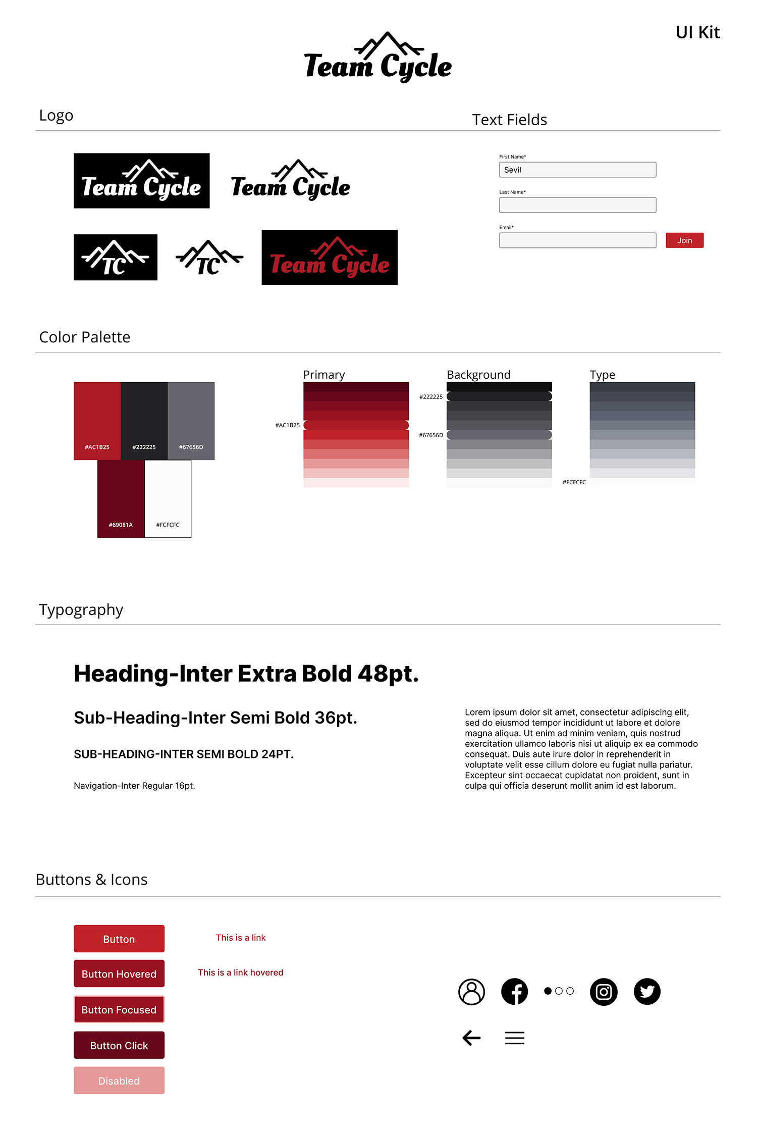
UI Kit:
This UI Kit was made as a tool for designing my high-fidelity screens.
High-Fidelity Design:
From this stage I dove straight into designing the website the way I envisioned it. I tried incorporate some of the same design language the original website had only with a more modern feel.
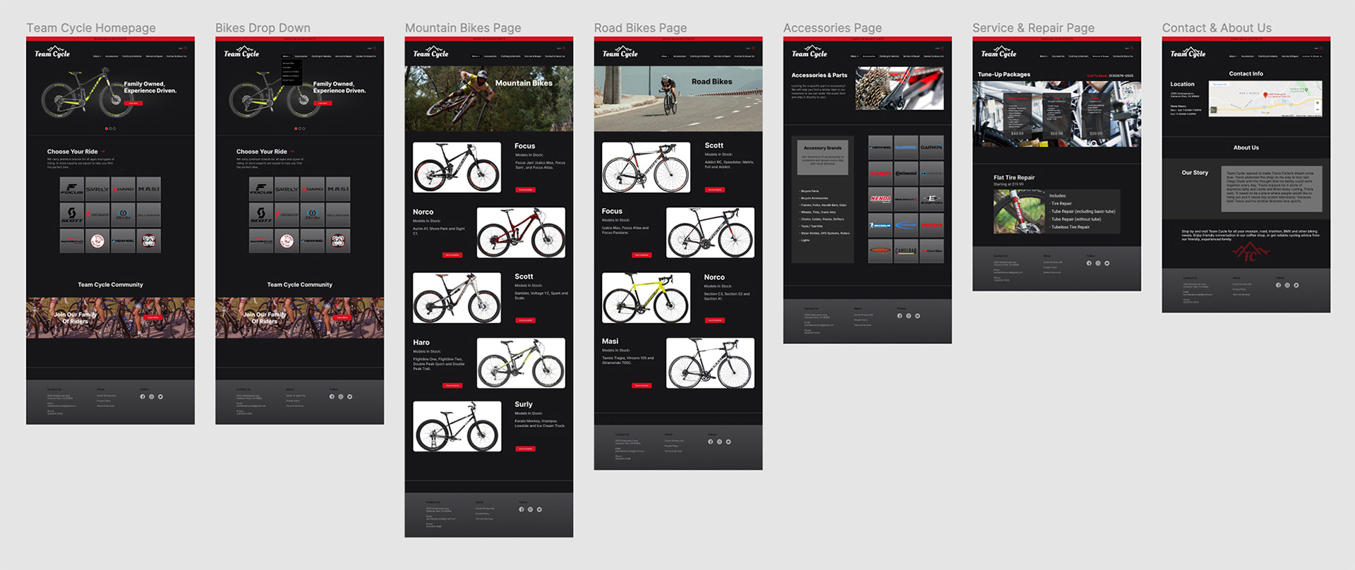
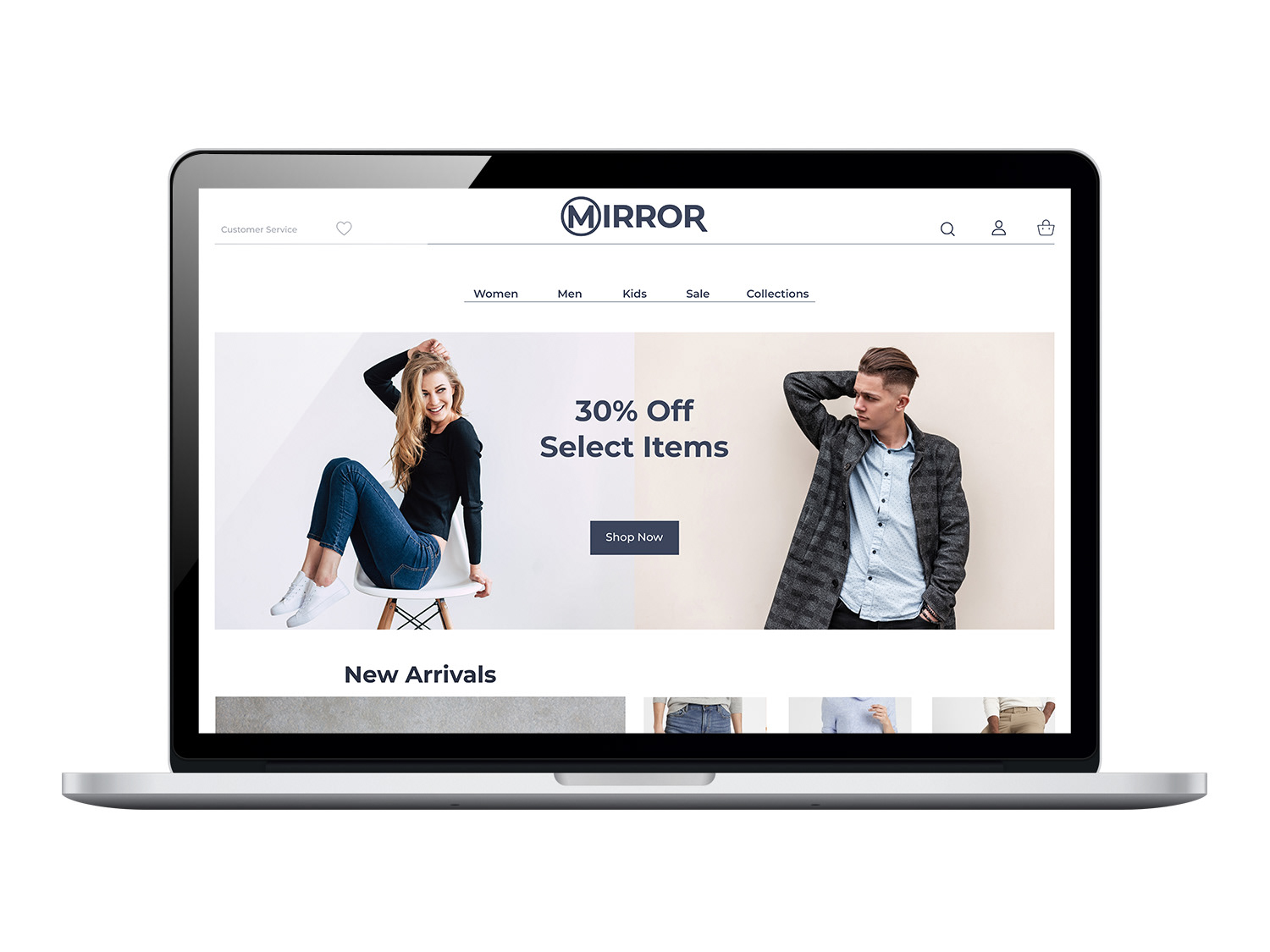
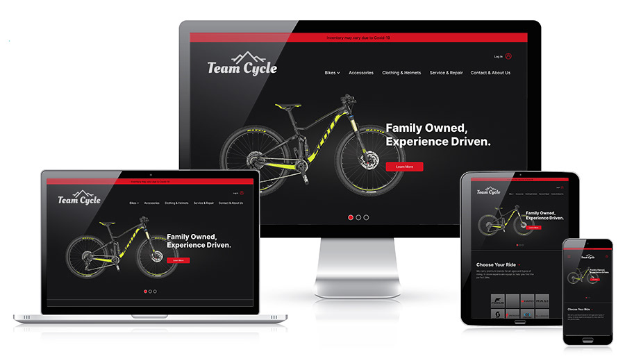
Responsive Screens:
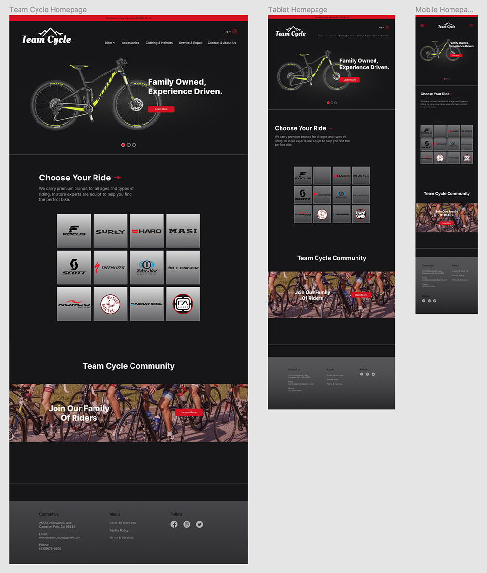
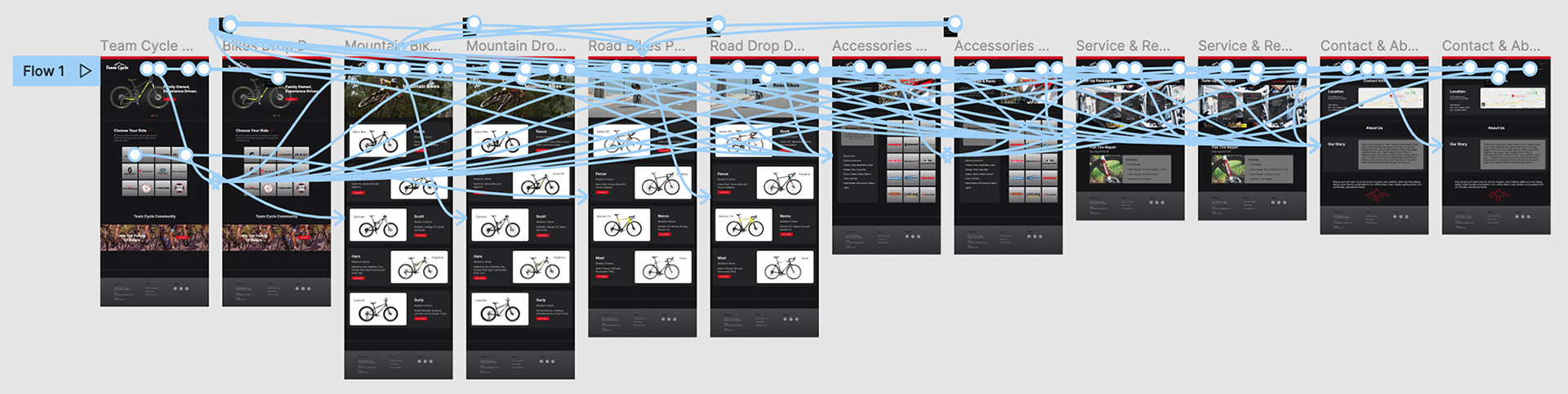
Prototype
High-Fidelity Prototype
Test & Refine
User Testing, Final Design
User Testing:
Scope:
- My usability testing was conducted on three participants, two women and three men, who all have experience with online shopping and general website use. Two of them have purchased a bike online. The goal was to observe them using my high-fidelity prototype and document the the way in which they moved throughout the UI in a set series of tasks.
Tasks:
1. Use drop down navigation feature for the products pages and easily navigate to them.
2. Clearly distiguish the bike models that are offered.
3. Easily navigate to the accessories page and identify the brands of parts that are offered.
4. Easily navigate to the services page and understand what packages are offered and their prices.
5. Navigate to the bikes pages by selecting the brand name tiles on the home screen.
Objectives:
- Test and understand the ease of use of my bike shop website.
- Observe points of confusion when navigating through the website.
- Test how easily users can identify the specific products offered.
- Find areas to improve the information architecture of the site.
- Get the instinctual reaction of the user to the service booking page and observe whether it makes sense.
Key Findings:
Insights
- The bikes page and service page need a few more bits of text to lead the eye down into the layout of the page.
- The drop down menu was recieved well and successful.
- Imagery was loved by all participants.
- Accessories page needs better differentiation between parts and accessories.
- The drop down menu was recieved well and successful.
- Imagery was loved by all participants.
- Accessories page needs better differentiation between parts and accessories.
Primary / Secondary Changes
- Tweak bikes page by adding some text to lead you down into the products.
- Add some spacing on the bikes page to give the content breathing room.
- Add some text on the service page to lead the user into the tire repair options better.
- Add some spacing on the bikes page to give the content breathing room.
- Add some text on the service page to lead the user into the tire repair options better.
- Show differetiation between accessories and parts offered on the accessories page.
- Add a text field to allow the user to enter email for store information.
- Add a text field to allow the user to enter email for store information.
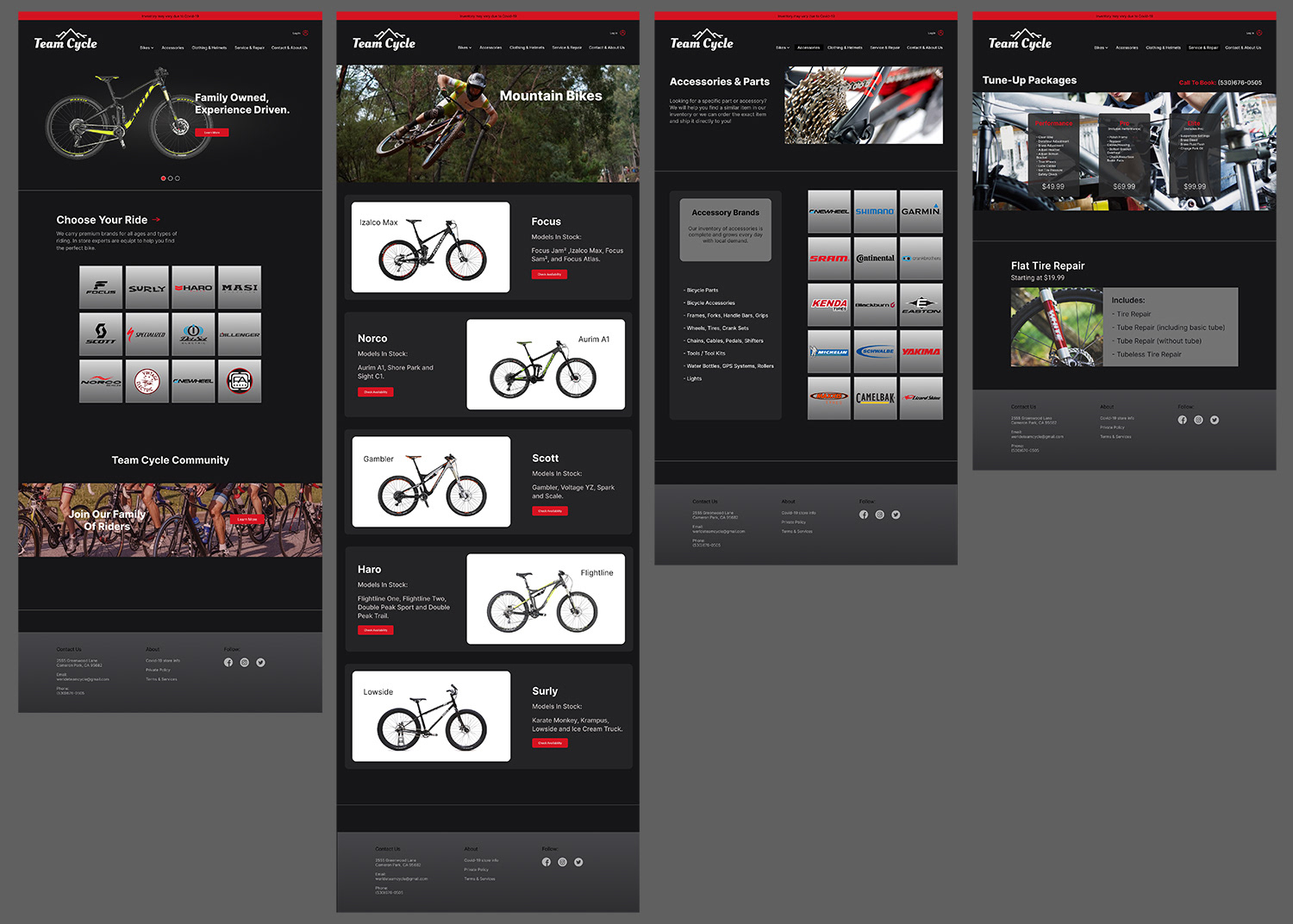
Final Design:
Reflection
Contacting a local business and working with them was a unique experience and quite enjoyable. While this project turned out to just be speculative, and not a real website redesign, I still treated it as though I was working with a real business. The owners of Team Cycle were very helpful and answered all the questions I had. Digging deep into the research part of this project helped me grow immensely, mainly with my interviewing skills. I believe my redesign of Team Cycles website effectively portrayed their original designs feel, but with a more modern and up to date style. I tried to stay true to their brand and I am proud of the work I was able to complete.
Next Steps
- Tweak bikes page by adding some text to lead you down into the products.
- Add some spacing on the bikes page to give the content breathing room.
- Add some text on the service page to lead the user into the tire repair options better.
- Show differetiation between accessories and parts offered on the accessories page.
- Add a text field to allow the user to enter email for store information.